Most working interior designers need 8–12 strong projects on the website, each represented by 6–10 final images, plus a rolling Instagram grid of 30–50 curated images and project-specific press pitch sets of 8–15 images each. Those are the working numbers I see hold up across Atlanta and Southeast designers I shoot for. But counting total images misses the point. The portfolio isn't one thing: it's three working surfaces, and each one has its own optimal count.
Most "portfolio image count" advice gives you a single number. That answers the wrong question. A working designer's portfolio lives across three surfaces simultaneously: the website project gallery, the Instagram grid, and project-specific press pitch sets. Each one has its own audience, its own scroll behavior, and its own decay rate. The rest of this post breaks down what each surface actually needs, how a single shoot's deliverables get distributed across all three, and the mistake most designers make that has nothing to do with quantity.
The Three Portfolio Surfaces
Each surface lives a different life. Confuse them and you'll either feel inadequate (looking at a 200-image Instagram and thinking your 12-project website is too small) or overshoot (loading every shoot's full take onto the project page). They're different jobs.
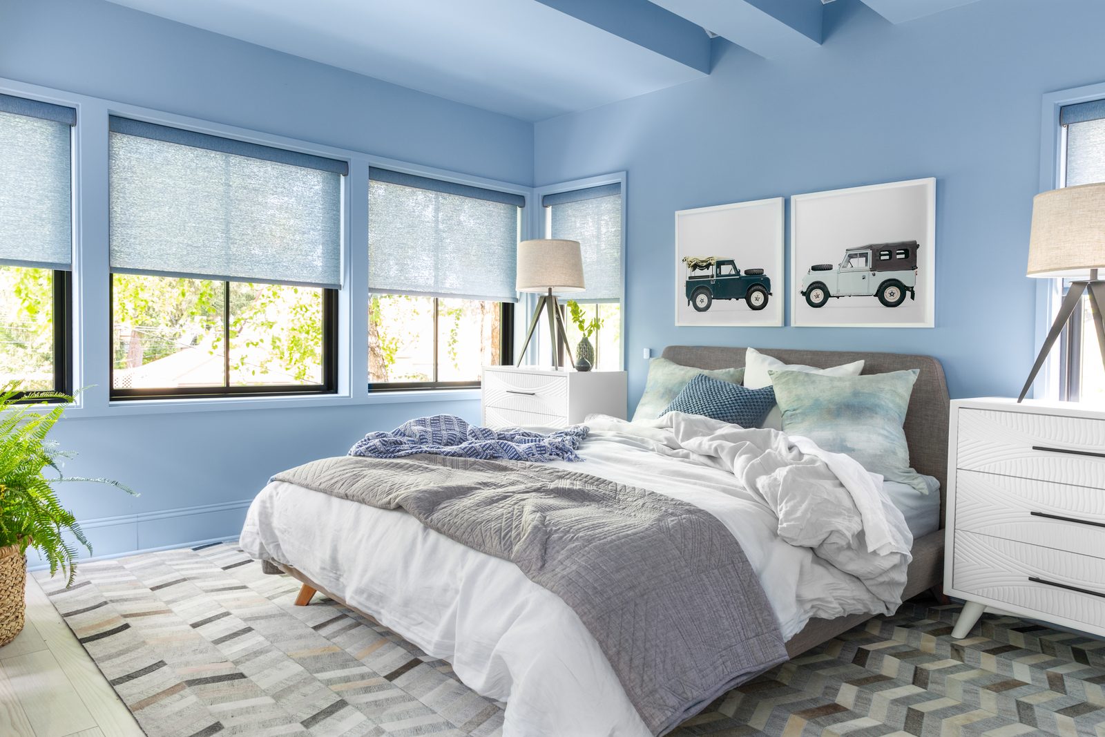
Website Project Gallery
Target: 8–12 projects total. 6–10 final images per project.
The website is the depth surface. Prospective clients land here to gauge range, style, and the scale of what you actually do. They're not scrolling for inspiration. They're qualifying.
Why 8–12 projects, not 20: editors and prospects rarely make it past the first 6–8 projects on a designer's site. Past 12 you stop differentiating and start blurring. Why 6–10 images per project, not 20: every image past the strongest 8 dilutes the project's impression. The 25-image project page reads as "I had a lot of images and didn't know which to cut." The 8-image version reads as "every frame here is intentional."
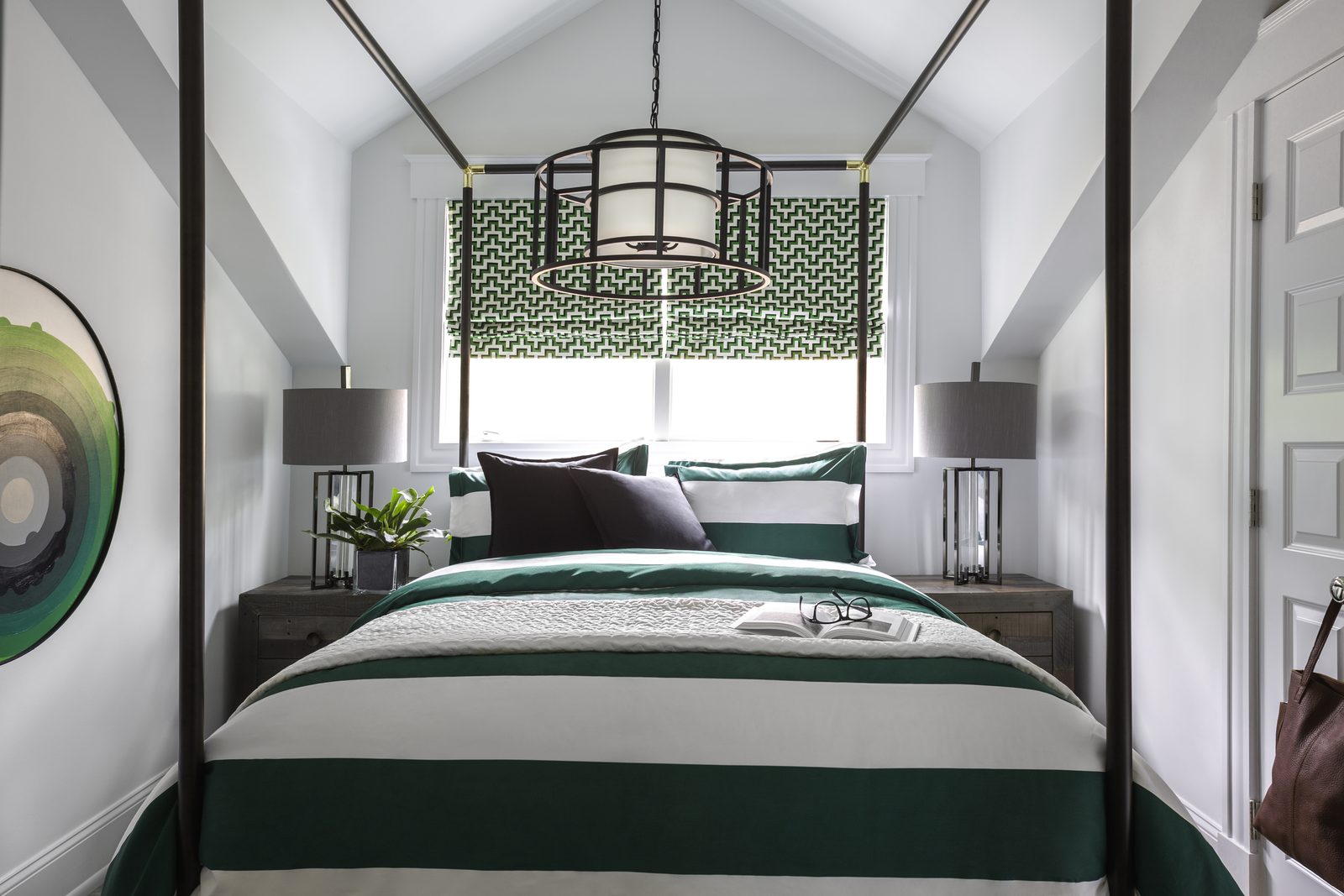
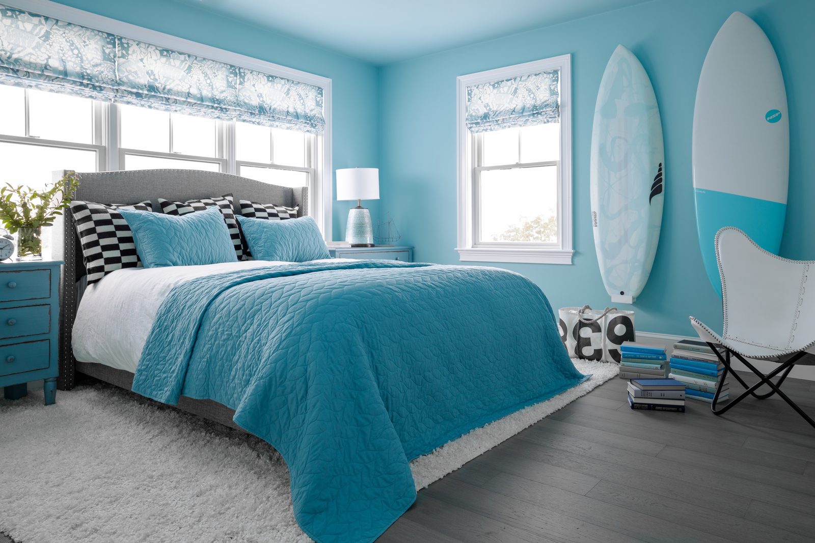
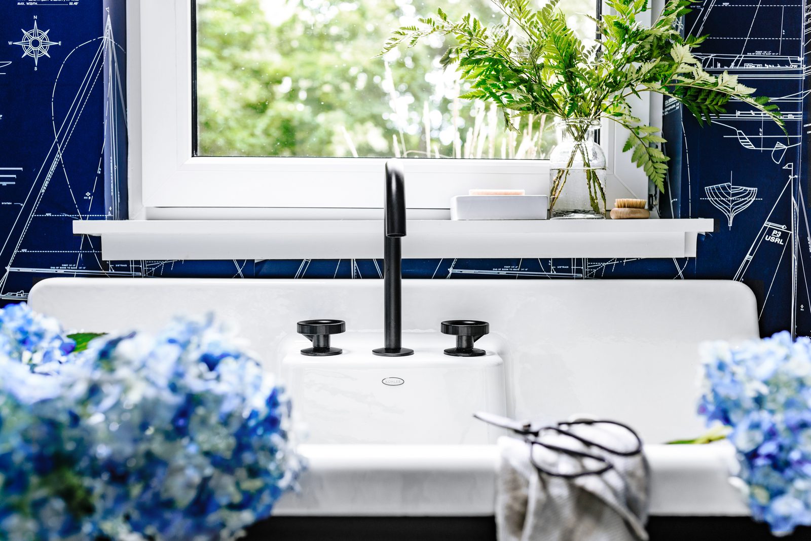
Each project page wants one cover-worthy hero image plus 2–3 strong supporting frames at the same caliber, then 3–6 contextual shots that round out the story. That's the structure that works.
If you're earlier in your career and you have three or four projects rather than ten, the same logic applies, at smaller scale. Show what you have well, rather than padding the gallery with weaker work to hit a number. A site with four strong projects, each shown in 6–10 thoughtful images, reads as competent and intentional. A site with eight projects where four of them are weak reads as inexperienced. The principles scale down before they scale up.
Instagram Grid
Target: 30–50 curated images in rolling rotation.
The grid is the discovery surface. First-time visitors (designers, editors, prospects) are deciding in three seconds of scroll whether you're someone they want to follow or work with. Most evaluate within the top 9–12 tiles, so your strongest hero images need to stay near the top.
Why 30–50: enough to give context (process shots, behind-the-scenes, close-ups) without diluting the hero work. Below 30 the grid feels new or thin; above 50, the latest project gets buried before anyone scrolls deep enough to see it.
The grid pulls from your website project images, supplemented with detail vignettes and process shots that don't appear elsewhere. That's where the variety comes from.
Press Pitch Sets
Target: 8–15 images per project, project-specific.
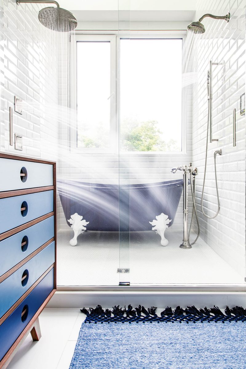
A press pitch is a different package from the website. Press needs a strong hero (vertical-friendly, since most shelter magazines are vertical-format) plus a wide establishing shot, a mid-range three-quarter, and 4–6 detail vignettes. Mix of horizontal and vertical for layout flexibility.
A separate question worth raising with your photographer or editor before pitching: how each publication treats images that have already appeared on social or your own website. Practices vary, and it's the kind of detail worth a dedicated conversation rather than a one-line answer. For more on what makes a project pitch-ready in the first place, I wrote about it here.
How a Single Shoot Feeds All Three Surfaces
A full-day editorial shoot in Atlanta typically delivers 12–15 final images. That's the raw material. Here's where it goes.
Roughly 6–10 of those images populate the website project gallery, the project's home base. 3–5 of those same images cycle into the Instagram grid over the following two to three months. And the same 12–15 images, often re-cut and re-ordered, become the press pitch set for that project.
Most images do double or triple duty. That's the design. A well-planned shoot gives the designer one set of files that simultaneously feeds the website, the IG rotation, and any press submission.
The thing that makes that distribution work is shot variety, not shot count. A 12-image shoot that's all wide-angle room captures can't lead a magazine pitch (no verticals), can't anchor an Instagram detail post (no close-ups), and gives the website nothing to break up the rhythm of the project page. A 12-image shoot with a healthy mix (wide, three-quarter, vertical, detail) does all three jobs.
That's the planning conversation that should happen before the shoot, not after. If your photographer doesn't know the images need to feed press as well as the website, the shoot won't yield the verticals, and you find out three months later when an editor asks for the cover frame.
The Hero Image Rule
One rule that simplifies portfolio planning: every project needs one cover-worthy hero image plus 2–3 strong supporting frames at the same caliber.
The hero is the project's thumbnail, its Instagram anchor, its press pitch lead, its website tile. One image working across every surface. Without a hero, the project exists in the gallery but doesn't earn attention.
How to know you have a hero: it works at thumbnail size. Shrink it on your phone and look at it from arm's length. If the composition still reads, the focal point is still clear, and your eye still lands somewhere intentional, you have a hero. If it goes soft and crowded at small size, you don't.
The other tell is compositional restraint. Hero images have one focal point. They don't have three competing centers of interest, a busy reflection in the mirror, or a styling object pulling your eye to the wrong corner. Every visual element earns its place.
Walking out of a shoot with 12–15 strong images but no clear hero is a planning failure, not a photographer failure. The hero comes from intentional planning: discussing the cover-worthy angle before the shoot, not hoping it emerges from the take.
The Real Portfolio Mistake: Stale Rotation
Here's where most portfolio advice misses the actual problem: the most common portfolio mistake isn't quantity. It's staleness.
The pattern looks like this. A designer shoots a strong project three years ago. The hero images go onto the website. They become her "lead" projects in pitches and consultations. They live there. Meanwhile, the work has evolved (new style direction, new client tier, new range of materials), but the website still leads with what was strongest in 2023.
Editors and prospects looking at the site can't tell the work has matured. The portfolio tells them the designer's last best work was three years ago.
This happens because curation is invisible labor. Nothing forces a refresh: no deadline, no client, no obvious benefit until you're already losing pitches you should be winning. The path of least resistance is leaving the portfolio as-is.
The fix is treating the portfolio as a working set, not a museum. A rolling portfolio: every new project earns a slot, and the weakest current slot rotates out. Quarterly, look at the lineup honestly: what's new, what's underperforming, what no longer reflects current style.
A rolling portfolio only works if every shoot produces enough usable images to feed the rotation. Which gets us back to planning.
What This Means for Planning Your Next Shoot
The thing to confirm with your photographer before the next shoot is shot variety per room.
Every key space should be captured in four framings: a wide establishing shot, a three-quarter mid-range view, at least one vertical orientation, and one or more detail vignettes. Not "lots of angles": those four, specifically. Each one feeds a different surface need.
Verticals make press pitches possible. Most shelter magazines are vertical-format, and a project shot only in horizontals will never lead a feature, no matter how strong the work is. Detail vignettes fuel the Instagram rotation and give the website project page the close-up moments that break up the rhythm of room shots. Wide establishing shots anchor the project on the website and set the scale of the space. Three-quarter mid-range views give editors and your own designers layout flexibility, since they sit between the wide and the detail and bridge the two.
When the shoot lacks one of those four framings, the project loses one of its surfaces. It might still serve the website fine, but it can't lead a magazine pitch. Or it has plenty of room shots but nothing tight enough to anchor an Instagram post. The shot count was right; the mix was wrong.
A short pre-shoot conversation, telling the photographer where these images will live (website only, or website plus press), is usually enough to make sure the four-framing variety gets captured for every key room.
The surface counts earlier in this post only work if the shoot was planned for them. The math starts before the camera comes out. For more on what to look for in a photographer who'll plan that way with you, I wrote about it here. And here's what to expect on shoot day once you've booked.
The Short Version
Most working interior designers need 8–12 strong projects on the website with 6–10 images each, a rolling Instagram grid of 30–50 curated images, and project-specific press pitch sets of 8–15 images per project. A typical Atlanta full-day shoot delivers 12–15 finals, and a planned shoot lets those images do double or triple duty across all three surfaces. Newer designers should follow the same principles at smaller scale rather than padding with weaker work. The bigger issue most designers face isn't volume. It's staleness, the same hero images carrying the portfolio for three years while the work has evolved. A rolling refresh, planned around the right shot variety in every shoot, fixes both problems at once. If you're trying to figure out what your next shoot should produce to feed your specific portfolio, I'd love to talk it through.
Quick Answers
How many images should be in an interior design portfolio?
The target on a designer's website is 8–12 strong projects, with 6–10 final images per project. Beyond the website, designers also maintain a rolling Instagram grid of 30–50 curated images and project-specific press pitch sets of 8–15 images each. Each surface has its own optimal count.
How many projects should an interior designer show on her website?
Most working interior designers should show 8–12 projects on the website. Fewer than 8 reads as inexperienced; more than 12 dilutes attention. Editors and prospective clients rarely make it past the first 6–8 projects, so curation matters more than completeness.
How many portfolio images do I need if I'm a new interior designer?
The same principles scale down. A new designer with three or four strong projects, each shown in 6–10 thoughtful images, presents as competent and intentional. Padding the gallery with weaker work to reach a higher project count actively hurts: a portfolio with eight projects where four are weak reads as inexperienced, while four strong ones reads as deliberate. Build the rotation up over time as new projects shoot.
How many photos should each interior design project have on a website?
6–10 final edited images per project. Anything past 10 dilutes the project's impression. Each project page should include one cover-worthy hero image, 2–3 strong supporting frames, and a mix of wide, mid-range, and detail shots, with at least one vertical orientation for layout flexibility.
How big should an interior designer's Instagram grid be?
A working portfolio Instagram grid carries 30–50 curated images in rolling rotation. Most editors and prospects evaluate within the top 9–12 tiles, so the strongest hero images stay near the top. The grid pulls from website project images plus supplemental detail and process shots.
How many photos should I send for a magazine pitch?
A press pitch package typically includes 8–15 images per project: a hero image (vertical-friendly), a wide establishing shot, a mid-range three-quarter view, and 4–6 detail vignettes. Editors need a mix of horizontal and vertical orientations to build a layout. Atlanta-based designers pitching national shelter publications should plan for vertical hero captures specifically.
How often should an interior designer refresh portfolio images?
The most common portfolio mistake isn't quantity. It's staleness. A rolling portfolio refresh, where every new project earns a slot and the weakest rotates out, keeps the work current. A practical cadence is a quarterly review of the lineup, with a full rotation every 12–18 months.
What shot types does every interior design project need?
Every key room should be captured in four framings: a wide establishing shot, a three-quarter mid-range view, at least one vertical orientation (for press), and one or more detail vignettes. Without that variety, the project can't feed all three portfolio surfaces: website, Instagram, and press pitches.