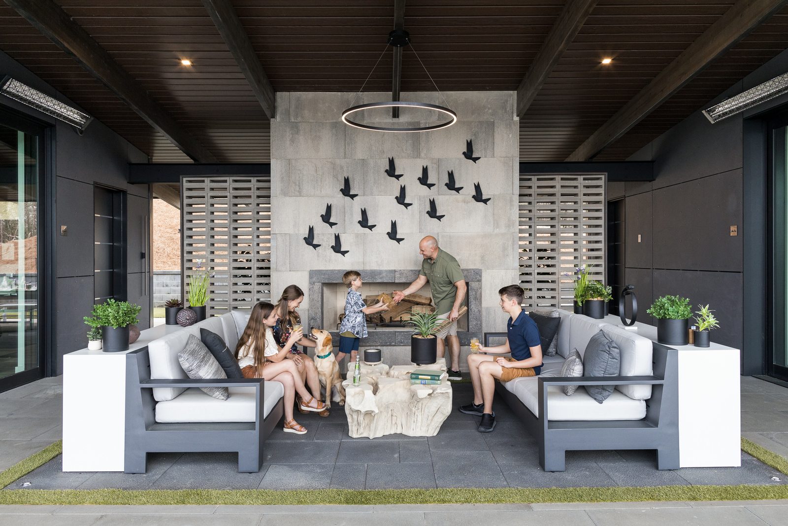
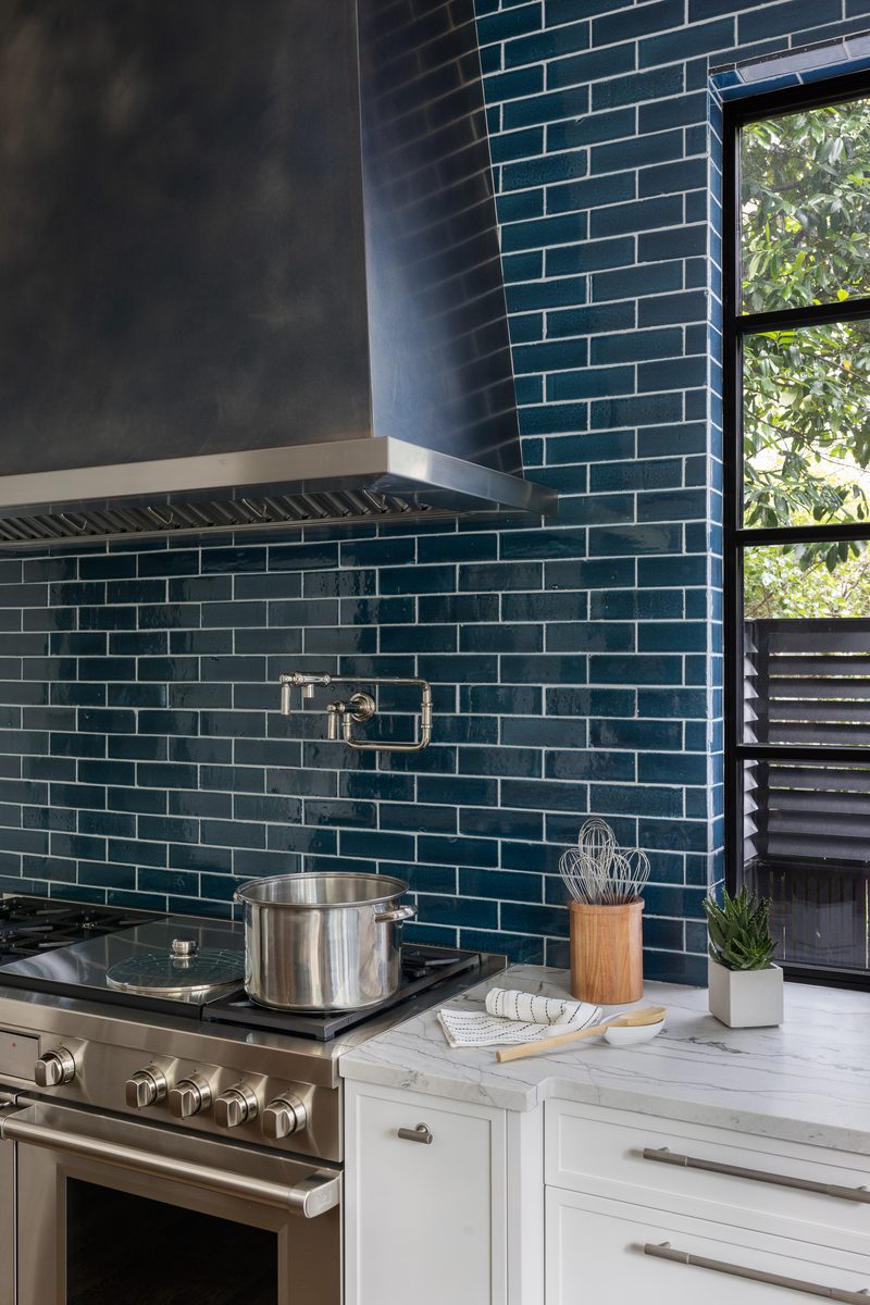
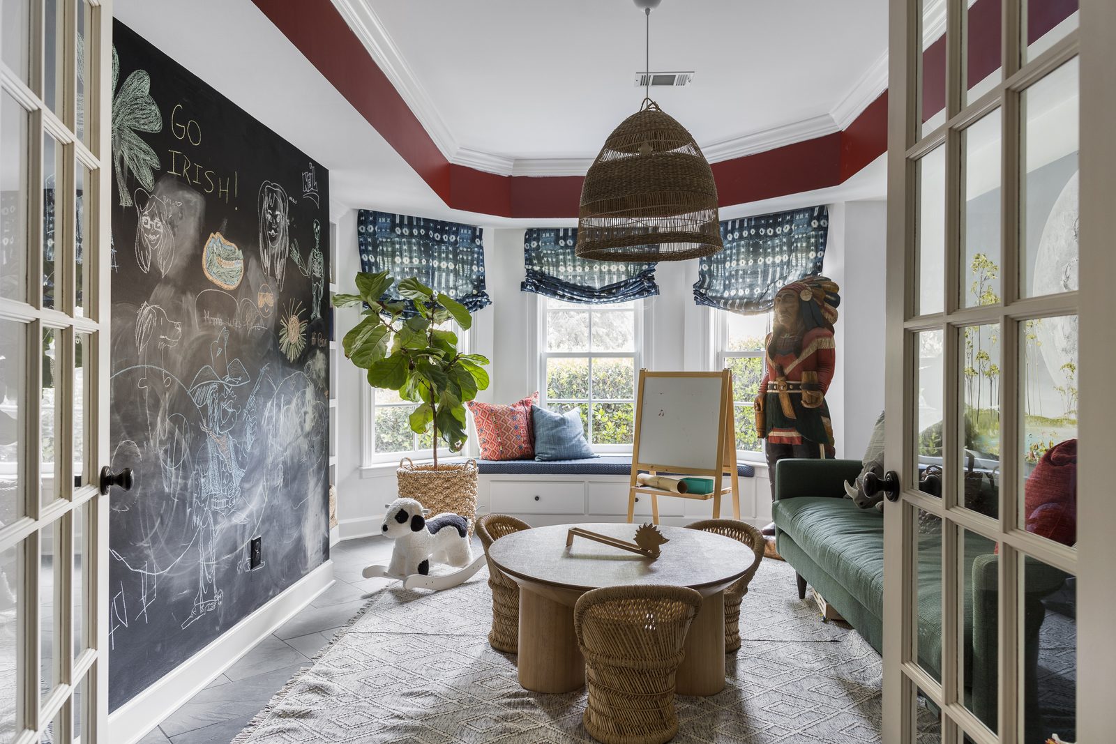
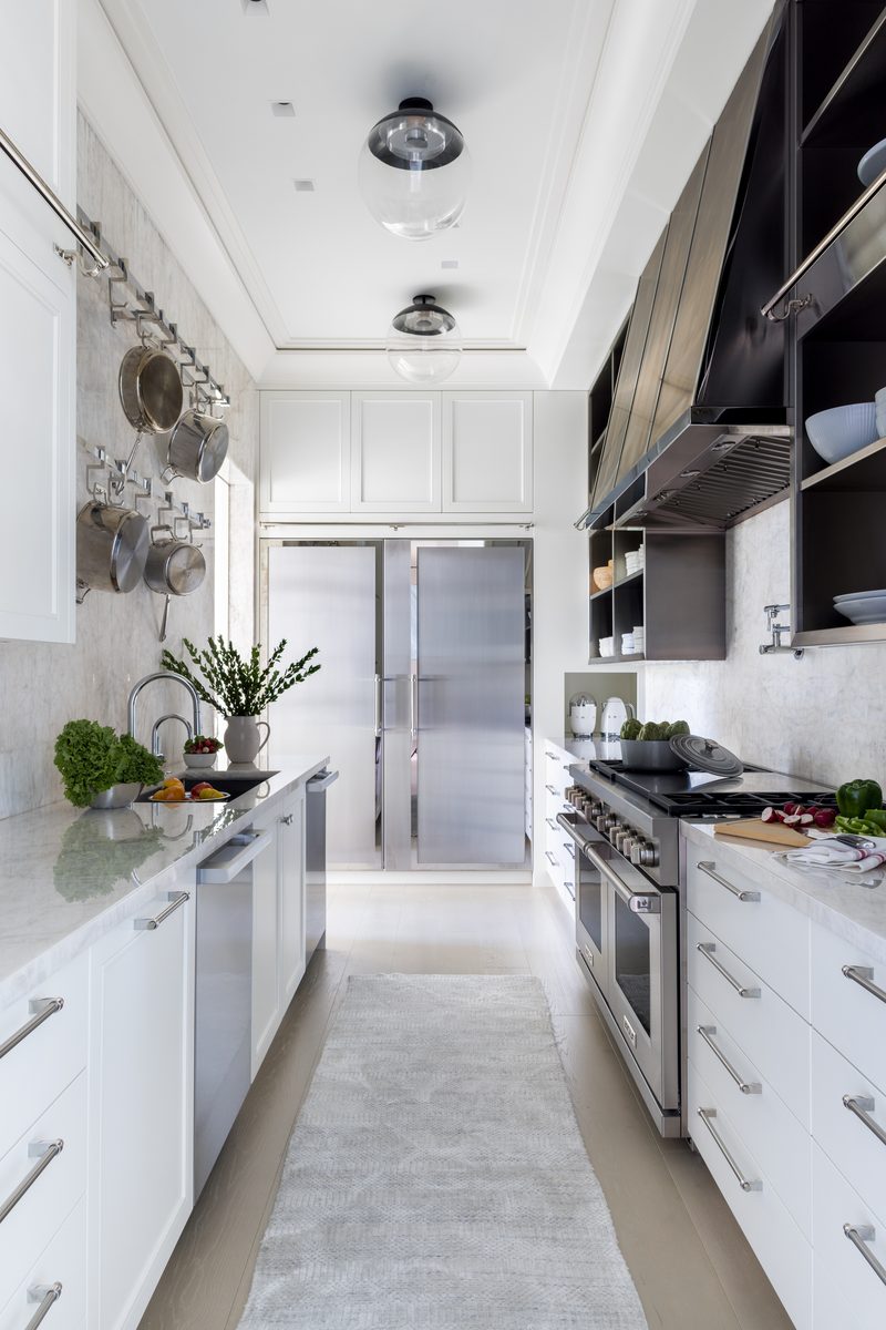
Not always, and not entirely. Fully styled photography (every surface art-directed, props and flowers brought in) is the right call for portfolio and press images that need to compete at a glance. Unstaged, as-lived photography, where a client's real belongings stay mostly in place, works better for social content and "real home" editorial. Most projects I shoot land in between: a handful of vignettes get full styling, the rest of the room stays close to lived-in.
I get asked some version of this on almost every shoot: how much do I actually need to style? The honest answer depends on where the photos are going and what job they need to do. Here's how I break it down on set, and how to figure out which end of the spectrum (or which middle ground) fits your project.
What Fully Styled Actually Looks Like on Set
Fully styled means every surface in frame has been decided on. Books are stacked and angled. A ceramic vase gets swapped three times until it reads right against the wall color. Flowers arrive that morning. Throw pillows get fluffed and re-fluffed between shots. Nothing in the frame is an accident.
This is a design team's best-case scenario: the room built to look exactly the way the designer imagined it, unconstrained by what the client happened to own. I've shot rooms where the stylist brought in a full car of props: art for empty walls, a stack of coffee table books color-matched to the palette, greenery to soften a hard corner. The client's actual objects might get edited out entirely if they don't serve the composition.
Fully styled is what most press placements and portfolio hero shots need. A shelter magazine editor or an Instagram scroll gives your image half a second to earn attention, and a curated vignette reads instantly as intentional. This is also the mode I default to when a designer tells me straight up: I need this to compete. If the goal is landing in House Beautiful or winning a bid against three other firms, styled is not optional. It's the baseline.
What Unstaged/As-Lived Photography Looks Like
Unstaged photography leaves the room mostly as the client actually lives in it. The mail on the counter might get tidied, but the family's real books stay on the shelf. The throw blanket stays wherever it landed. Nothing gets trucked in.
This approach has grown fast the last few years, and I think it's a real shift, not a trend that fades. Social audiences are tired of rooms that look like nobody lives there, and there's a fatigue with the over-styled, catalog-perfect shot. "Real home" content performs better precisely because it reads as honest. I've had clients specifically request this: they want images that look like their actual life, not a set.
It's also the right call for clients who are uncomfortable with heavy styling, and there are more of these than you'd think. Some homeowners find a stylist rearranging their belongings genuinely stressful, especially on a first shoot. Unstaged photography respects that discomfort while still delivering images with intentional composition and controlled light: the fundamentals that separate design photography from a real estate listing shot, as I've written about before. Unstaged doesn't mean unconsidered. It means the objects in frame are real, even when the light and composition around them are still fully controlled.
⭐ The Decision Framework: Which Approach Fits Your Project
Here's how I'd walk a designer through this before a shoot day.
Choose fully styled when:
The images are going to press, an awards submission, or a portfolio hero shot
You're competing for new business and need the room to read as aspirational in under a second
The room genuinely needs help: empty walls, sparse surfaces, a client who owns very little decor
You have styling budget and time built into the shoot day
Choose unstaged/as-lived when:
The content is going to social, where authenticity outperforms polish
The client is uncomfortable with their belongings being moved or replaced
The room is already well-appointed and doesn't need additions
You're documenting a real family's home for a "day in the life" or profile-style feature
Choose selective styling (the middle ground) when:
You want press-quality hero shots but don't have full styling budget for every room
The home is lived-in but has 2-3 spaces (an entry vignette, a dining table, a coffee table) that would benefit from a styling pass
You want the spread to read as both aspirational and believable, which, in my experience, is what most magazine editors actually prefer
That third category is where most of my shoots actually land, and it's worth understanding why.
Book a Session
Not sure which approach fits your next shoot?
Let's talk through where the images are going and who's looking at them before we ever walk in the door.
Selective styling means a few key vignettes get full treatment while the rest of the room stays close to how the client left it. On a typical shoot, that might mean the dining table gets a full tablescape (plates, linens, a low floral arrangement) while the adjacent living room gets a light pass: pillows squared, a throw folded, nothing added that wasn't already there.
This works for a few practical reasons. It's faster: you're not styling twelve surfaces, you're styling three. It's cheaper, since props and flowers add real cost to a shoot day, and cutting that spend to a couple of key moments instead of the whole house makes styling economical even on a half-day session. And it holds up better under a magazine editor's eye than you'd expect, because editors have gotten good at spotting a room that's been over-produced.
I've noticed this firsthand: a spread with one gorgeous, fully art-directed tablescape next to a genuinely lived-in reading nook often reads as more credible than a house where every single frame looks staged. It signals that the design is strong enough to hold up without full intervention everywhere. Overstyling can actually undercut the story, a point I get into in more detail in what interior styling decisions undermine photography.
If you're planning where to spend styling effort, my advice is simple: pick the two or three vignettes most likely to become your hero shots (usually an entry, a dining or kitchen moment, and one seating area) and put your styling budget there. Let the rest of the house be itself. And however you land on the spectrum, the prep still matters; a lot of what makes a shoot day run smoothly comes down to basic readiness, which I cover in how to prepare your space for a shoot.
Timing This Decision Before Shoot Day
This is a conversation to have before the shoot, not on it. Styling intensity affects how much time I need to schedule, whether a stylist should be on set, and how many finals we're realistically going to pull from each room. A fully styled room might take 45 minutes to shoot well; a lightly styled one might take 15.
I always ask designers upfront: where is this going, and who's the audience? A submission to a design award has different needs than a client's Instagram story. Knowing the destination before we walk in the door means we're not guessing on styling decisions mid-shoot, which is when things get rushed and the room starts to look thrown-together instead of intentionally undone.
The Short Version
Styling intensity is a spectrum, not a binary: fully styled means every surface is art-directed with props and flowers brought in, built for portfolio and press images that need to compete at a glance; unstaged/as-lived keeps a client's real belongings mostly in place, which reads as authentic and works well for social content or clients uneasy with heavy staging. Most shoots I do land in a selective middle ground: two or three vignettes get full styling treatment while the rest of the room stays close to lived-in, which is faster, cheaper, and often reads more credible in print than an over-produced house. The right choice comes down to where the images are going and who's looking at them. If you're not sure which approach fits your next shoot, that's worth a quick conversation before shoot day, so let's talk it through.
Quick Answers
Do I need to style my space for interior photos?
Not entirely, and not always. If the images are for press or a portfolio hero shot, some styling helps them compete. If they're for social or a client wants their real home shown, minimal or no styling often works better and reads as more authentic.
What's the difference between styled and unstaged interior photography?
Styled photography art-directs every surface: props, flowers, and staged vignettes brought in for the shoot. Unstaged photography leaves the client's real belongings mostly as they are, aiming for an authentic, lived-in feel rather than a produced one.
Should I style every room for a photo shoot?
No. Most working shoots style two or three key vignettes (an entry, a dining moment, a seating area) and leave the rest of the space close to lived-in. This is faster, costs less in styling spend, and often reads more credible than a fully staged house.
Is unstaged photography less professional than styled photography?
No. Unstaged photography still uses intentional composition and controlled light, the same fundamentals that separate design photography from a real estate listing shot. What changes is whether the objects in frame are staged additions or the client's real belongings.
When should I hire a stylist for a photo shoot?
Hire a stylist when the images are going to press, an awards submission, or a portfolio piece that needs to compete against other firms at a glance, or when the room is sparse and needs additions to read well. Skip it, or scale it back, when the space is already well-appointed or the client prefers their real home shown.